If you’re a regular over at One Green Planet, you might have seen some of my recipes published in their Recipe Monster section. And if you’re not a regular, you should check it out! OGP is a fantastic resource for all things animal- and eco-friendly, from tips on living consciously to sweet animal stories to brighten your day.
Recently, my contact over at OGP let me know about a brand-new iPhone app they’re launching on Earth Day (April 22) and asked if I wanted to try it early. Um, yes please! I’d just gone through the arduous task of making space on my phone, so I figured I might as well fill up that space with an all-vegan recipe app. Read on for my thoughts!
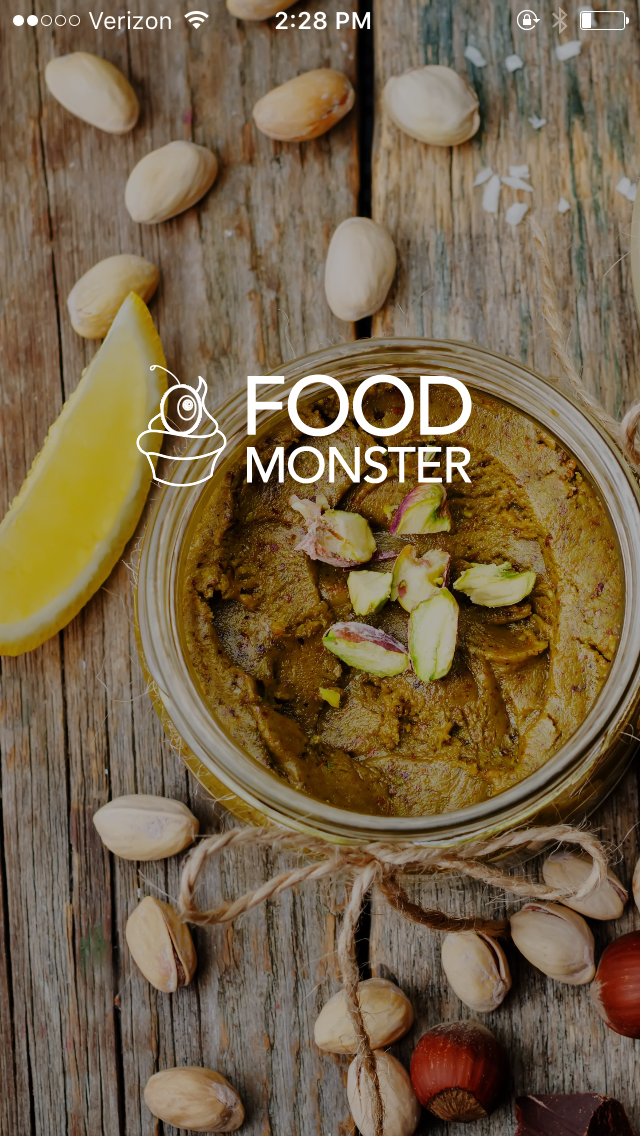
When you first open the Food Monster app, you’re treated to a stunning photo overlaid with the OGP logo. (See screenshot above.) I like the simplicity of that opening shot (which varies each time you open the app), but I wish it stayed there longer and that you could access a menu from that open screen. Instead, the app quickly jumps you right into the main page, and not quite seamlessly — there’s a little lag, and the image gets stuck for a second.
Once you’re into the app proper, here’s what you can do:
- Review the latest recipes from the home screen. Tapping a recipe brings you to a screen with more info, including the ingredients, prep steps, and even comments for that particular recipe. You can also add the recipe to your favorites or send it to someone using the standard iOS sharing options.
- Access “features,” which are OGP’s Buzzfeed-style lists (e.g., 15 Ooey-Gooey Caramel Recipes), and then follow links to the recipes listed in those features.
- Search for recipes by ingredient, name, or other keywords. There’s also the option to search within your bookmarked recipes only, which is handy if you know you saved something and want to find it quickly.
- Browse recipes in a variety of ways, including by season, meal, ingredient, or diet (e.g., high-protein, gluten-free).
- Peruse collections of recipes, like “American Fusion” and “Single Serve.”
- Stay on top of what’s hot with easy access to popular themes and recipes that are currently going viral.
- Bookmark your favorite recipes to use later.

What I like:
- The integration with OGP’s lists (aka the features). The OGP editorial team must have it pretty good — they get to compile lists of mouth-watering recipes and share them with hungry vegans! I always enjoy their lists and I like that they’re included in the app so that users have a different way to access content (rather than just searching or browsing recently added recipes).
- The multiple ways of finding content. I appreciate that you can browse pre-made collections (see screenshot above) or narrow down your search using keywords.
- That the collections aren’t just simply based on type of meal or ingredient — they’re more creative than that. Having pre-made lists of budget-friendly recipes or quick recipes is really handy.


What I don’t like:
- In the recipes themselves, fully half the screen is taken up by the bottom of the featured photo, the author’s name, recipe tags, and tabs for ingredients, preparation, discussion, and similar collections. So you’re losing half the screen real estate for what’s arguably the most important feature of this app — reading the recipe itself! When I’m cooking, nothing is more annoying than needing to scroll down after every little step. I’d prefer to see the entire recipe on my screen, or at least most of it. (See first screenshot in the gallery above.)
- The way the menu bar at the top requires you to manually scroll to see the different links (i.e., on the homepage, the word “Features” is cut off in the default view). It’s not intuitive to have to manually scroll to the right — it feels like the app was designed as a recreation of the desktop site, which is not the best way to design for mobile. (See second screenshot in the gallery above.)
- The animations are in general a little clunky — they often lag or stick a little bit, which detracts from the overall user experience.
- The fact that you can’t access the home screen by tapping the Food Monster logo at the top — that’s how I intuitively want to do it, but it doesn’t work. Instead you have to tap the hamburger button, which opens a menu on the left side, and tap Home from there.
- Within a recipe, there’s an option to favorite the recipe with a simple heart icon or by tapping a bookmark icon, which opens a menu and lets you categorize it by meal or diet right then and there. Having two ways to save a recipe seems unnecessarily confusing.
My overall opinion is that this app was generally well-thought-out, but it has some implementation issues. The design mixes very modern, clean images (i.e., the opening screen) with a slightly dated design on the interior screens. I can tell that the developers and UI team wanted to mimic the look and feel of the OGP website, but I’m not convinced it fully works on mobile. The laggy animations are distracting, and it’s a little buggy — I had trouble getting links to work a few times.
Is it worth $19.99? I don’t think so. Few apps are; twenty bucks is super steep and is not at all in line with market prices. All the content on Food Monster is available (for free!) on OGP’s website, making it difficult to justify the high price tag.
That said, I’m looking forward to using it more thoroughly over the next few months to get a better sense for how well it works when I’m in the kitchen. In the meantime, I’m saving all sorts of delicious-looking recipes for later use!
~~~
The Food Monster app will be officially released on 4/22, but you can purchase and download it early using this link. If you do, let me know what you think!
~~~
*Disclaimer: I was given a free one-year subscription to the app (valued at $19.99), but all opinions are thoroughly my own.
